2022
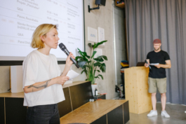
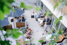
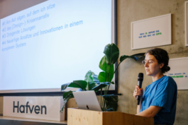
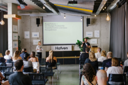
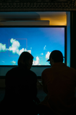
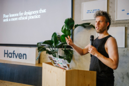
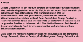
In 2022, we hosted Superfuture for the first time: this week-long design festival in Hannover brought together local and international designers and design enthusiasts to share innovative approaches and exchange methods and practices in design as a driving force for a regenerative future. How can we design without depleting our world socially and ecologically? And what is the role of design in the 21st century?
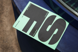
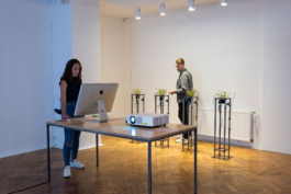
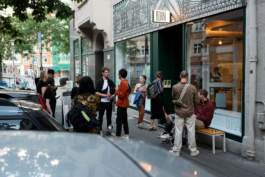
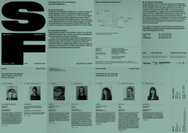
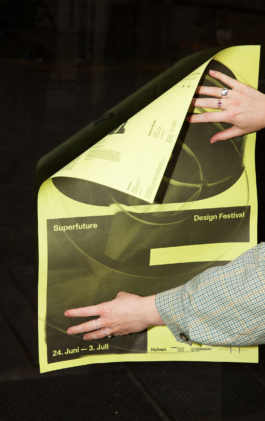
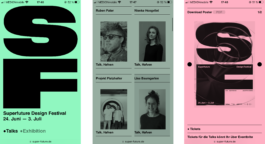
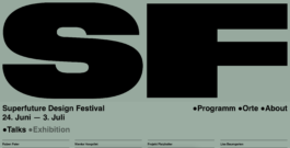
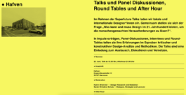
In its first year, the festival consisted of two formats: The talk format with impulse lectures, panel discussions, round tables and an After Hour at the Hafven Hannover - and the exhibition format "Nature's Commodities" at the Galerie BOHAI e. V. In addition to the conception and organisation of the festival, we also developed the visual identity of the event and derived the media for all communication channels from it. The design challenge was to visualise the theme of the future for the target group (people with an affinity for design) without using worn-out, classic technoid clichés. In addition, the name "Superfuture" in its deliberate exaggeration deals ironically with the global status quo and at the same time evokes positive, constructive associations. This ambiguity had to be translated into visual terms with the necessary sensitivity.
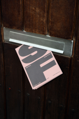
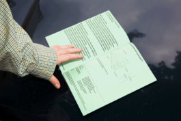
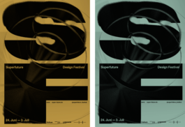
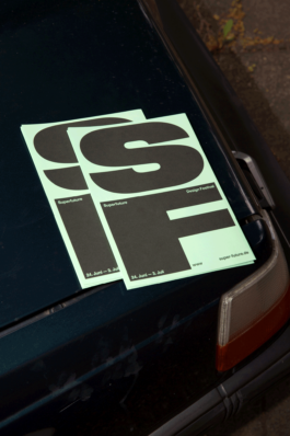
The boldness of the name is taken up again in the bold typography. The initials S and F always play the first level of the communicative means/media. We worked across all media with alternating colours that symbolise different possibilities of the future. The print media are printed on different coloured paper. On the website, there is a colour change with each page change or reload of the page. For social media, these RGB equivalents are also used — heterogeneous photographs are coloured and thus fit well into the overall picture. As a key visual, a three-dimensional implementation of the "Future Cone" complements the typography — a model used to represent alternative futures.
Bureau Bordeaux
• Categories
Identity, Flyer, Poster, Exhibition
Art Direction, Graphic Design, Editorial Design, Exhibition Design, Webdesign
Claudia Bumb, Bureau Bordeaux
Bureau Bordeaux
Henner Rosenkranz (Galerie BOHAI)
Katrin Brümmer, Claudia Bumb, Bureau Bordeaux
Monument Grotesk (Dinamo)
Umweltdruckhaus, Langenhagen
Paper:
Woodstock (Fedrigoni)
Funding:
Supported by the »Innovationsfond« of the »Landeshauptstadt Hannover«
Photography:
Henner Rosenkranz (Galerie BOHAI)
Ole Spata


Monday to Friday, 10:00 — 18:00
• Open
• Closed
+49 (0)511 940 02913
mail@bureaubordeaux.com
Bureau Bordeaux
Königsworther Str. 33
30167 Hannover
Monday to Friday, 10:00 — 18:00
• Open
• Closed
+49 (0)511 940 02913
mail@bureaubordeaux.com
Bureau Bordeaux
Königsworther Str. 33
30167 Hannover
© 2026, Bureau Bordeaux