2020
WortLaut is a city-wide, decentralized participational event. The aim is to show the breadth of the literary, linguistic and intercultural diversity of Hanover and thereby arouse enthusiasm for language, reading and words. At the same time, the festival wants to encourage all residents of the city to find their voice, offer them a stage to actively shape and participate in their living space and the festival program.
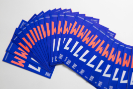
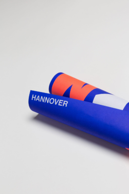
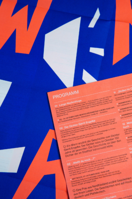
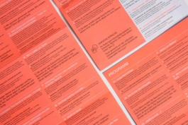
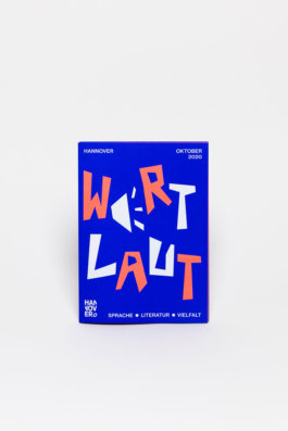
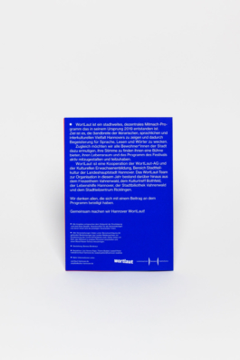
As co-initiators of the festival, we took responsibility for the graphic design of the event program and posters. The main phase of the festival planning took place in spring 2020 – during the peak of the Covid-19-related lockdown. At this point it was unclear whether the target group would still be affected by the closure of cafes, pubs and shops and whether it would be effective to put out a printed program. We therefore decided to equip the program with a poster motif on the back, so that the poster can develop an advertising effect at least in the shop windows during a possible lockdown.
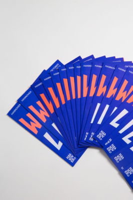
In order to create an increased long-distance effect, we decided to work with bold colors. The two pantone tones (supplemented by the color black for the reading texts) activate the large-scale typography, which, with its cut-out look, brings the festival's self-made character to the fore.
• Categories
Poster, Flyer, Program, Identity
Art Direction, Concept, Editorial Design
Bureau Bordeaux
Neue Haas Grotesk


Detail
Detail
Cover
Back
Wortlaut
Monday to Friday, 10:00 — 18:00
• Open
• Closed
+49 (0)511 940 02913
mail@bureaubordeaux.com
Bureau Bordeaux
Königsworther Str. 33
30167 Hannover
Monday to Friday, 10:00 — 18:00
• Open
• Closed
+49 (0)511 940 02913
mail@bureaubordeaux.com
Bureau Bordeaux
Königsworther Str. 33
30167 Hannover
© 2025, Bureau Bordeaux